In the ongoing COVID-19 pandemic, although the state of emergency has been lifted in Japan, in many countries however, the cities are being sealed off even more tightly and the movement of people is severely restricted. In this article, I will use published data to examine how movement has changed during the pandemic.
In the US, there is a statistical indicator called “vehicle miles traveled” (VMT), which estimates the total distance traveled by automobiles nationwide. The aim of the indicator is to estimate the rate of change in traffic volumes. The US Federal Highway Administration (FHWA) compiles the indicator based on data submitted by the individual states, and publishes it on a monthly basis. The VMT indicator has a long history: on the FHWA’s website, one can find VMT data all the way back to 1970 (Fig. 1).
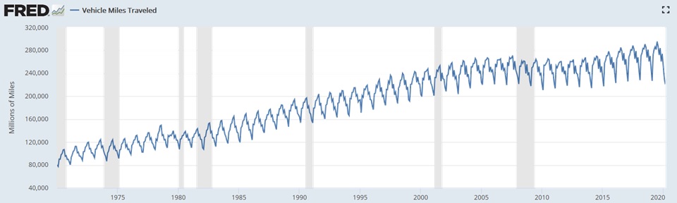
Fig. 1. VMT over time (1970–2020)
It is said that distance traveled is closely related to economic growth, and in fact it can be seen from the change in VMT over time that distance traveled has increased in tandem with US economic growth; it is clear that during the oil crisis of the 1970s and the financial crisis of 2008, VMT either decreased or remained flat.
To obtain these data regarding movement, traffic volumes are monitored via sensors installed in 5,000 locations on major roads and on highways throughout the US, and the results are multiplied by the lengths of the roads in question. Then each state estimates the total distance traveled within the state, and the FHWA aggregates the state figures to come up with the nationwide VMT figures. Besides the basic monthly VMT figures, in order to make year-to-year comparisons easier, the data is also processed in a variety of ways such as through seasonal adjustments to correct for variations based on factors such as the day of the week and the number of holidays. However, despite the fact that the US is huge, with the length of its total road network being approximately 6.6 million km,*1 the country has only 5,000 measuring sites. This means that the density of measuring sites in the US is roughly half*2of Japan’s automatic number-plate recognition system (the “N System”), so the US system may not really be adequate. I therefore conclude that the underlying rationale used in calculating the US’ published estimates ought to be reexamined. Nevertheless, the fact that the data itself has been collected continuously for half a century makes it very useful for identifying relative changes over time.
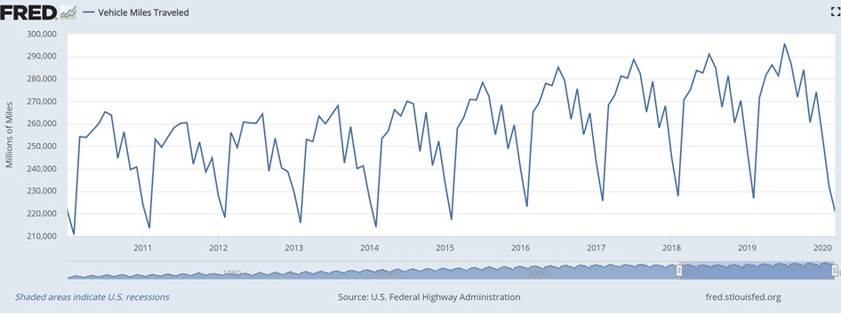
Fig. 2. Monthly VMT and seasonally adjusted VMT over time (2010–2020)
Looking at monthly fluctuations, one sees an interesting phenomenon: a fixed, mountain-chain-like pattern that recurs year after year, with a peak in July and a valley in February (Fig. 2). The decline that takes place in February of each year is quite large. In 2019, whereas the peak VMT in July was 296 billion miles, the valley in February was 227 billion miles, or 23% less than the peak, showing that the seasonal fluctuations are considerable. I believe that these fluctuations are linked to a number of factors.
- VMT is high in summer because a lot of people take long vacations and head off on outings and trips, mainly around July 4th (Independence Day).
- Conversely, VMT is low in winter because people go out less, which is a result of there being snow on the ground, snowstorms, and etc. It is reported that during blizzards, cities are frequently shut down, including businesses, schools, and commercial facilities.
- VMT is also affected by other calendar events, such as spring break for schools in March, Thanksgiving holidays in November, and Christmas holidays in December.
In short, VMT is closely tied to people’s lives and activities.
Going into greater detail, the data are broken down into “rural” and “urban,” and each of these is further broken down into “interstate,” “other arterial,” and “other.” When the rural and urban shares of VMT are calculated, in 2019 urban roads accounted for 69.7% of total VMT and rural roads represented 30.3%, indicating that urban roads accounted for more than two-thirds of the total VMT.
However, in the latest data in March 2020, VMT has clearly broken with the annual pattern and plunged deeply. This plunge is, of course, due to urban lockdowns and stay-at-home requests in response to the coronavirus pandemic. Because the states of the US declared states of emergency on different dates, e.g., the state of Washington on February 29th and the state of Florida on March 1st, it is not easy to evaluate the impact of lockdowns on VMT. Nevertheless, VMT in March 2020 was down by 18.6% compared to the figure for March of the preceding year.
Because official FHWA data are only available till March, I took a look at the figures from StreetLight, a data analytics service company. StreetLight compiles its own VMT statistics based on car and smartphone GPS data, and because it publishes day-by-day data, the company’s data allow us to see in detail the impact of the lockdowns (Fig. 3).
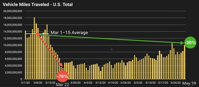
Fig. 3. Daily VMT over time (March 1st – April 12th, 2020)
From StreetLight’s data, it is apparent that VMT declined significantly after states of emergency were declared. A national emergency was declared on March 13th, and the VMT for March 22nd, on the weekend of the week after the declaration, was in fact 76% lower than the average VMT for the first half of March. Looking at days of the week, it is clear that prior to the nationwide declaration, VMT was low during the week but then high on Fridays and weekends. After the declaration the situation reversed, with VMT being lower on weekends than on weekdays, this is an indication of how well the stay-at-home policies were adhered to in the US. Finally, we can see up through the end of May that as states gradually lifted their states of emergency, the movement is also slowly recovering.
The evolution of technology has made it possible to obtain and analyze driving data in greater detail, and there are high hopes for what this can bring about. Data can now be put to work to analyze human behavior more accurately and easily. These types of technologies enable us to see the effects of the coronavirus pandemic more clearly and analyze the data more accurately.
If we look at other countries, IHS issued forecasts through 2040 for total VMT in major areas of the world in 2017.*3 According to the forecasts, between 2017 and 2040 total VMT in the US, Europe, China, and India will increase by 65%, and roughly 40% of this increase will come from MaaS (Fig. 4).
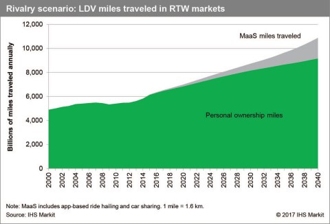
Fig. 4. Projected VMT in major areas of the world through 2040
It is reported that during the coronavirus pandemic, people have been avoiding MaaS services such as Uber and car sharing in order to avoid being infected, that’s why the use of these services has declined dramatically. I intend to find out what effect the pandemic will have on MaaS and how VMT varies in response to economic trends. From here on out, I will use the data to take a look at trends in both of these areas.
*1: CIA World Factbook, “Total length of road network”, https://www.cia.gov/library/publications/the-world-factbook/geos/xx.html
*2: The total length of Japan’s road network is approximately 1.2 million km,*1 and the number of N System (automatic number-plate recognition system) sites on that network as of 2015 was 1,690,*3
so a calculation of the density of measurement sites in the US reveals that it is about half that of Japan’s N System.
*3: “Himitsu atsukai no ‘N shisutemu’ kiroku,” Sankei Shimbun, March 1st, 2016,
https://www.sankei.com/affairs/news/160301/afr1603010027-n2.html
Sources for figures
Figs. 1–2 : Federal Reserve Bank of St. Louis, https://fred.stlouisfed.org/categories/33202
Fig. 3. : StreetLight Data, https://www.streetlightdata.com/
Fig. 4. : IHS Markit, https://www.greencarcongress.com/2017/11/20171114-ihsmarkit.html